Showing posts with label samples. Show all posts

Tuesday, November 5, 2019

Penciling CRAZY! (and Some Sketches that Never Flew!)

Below are scans of the original pencils for my contributions to CRAZY!, the one-shot published by Marvel Entertainment in October 2019. "The No-Prizes" was drawn from a plot by Frank Tieri and John Cirelli; the "Galactus Go-Kart" pin-up was written (if you want to call that writing!) by me.

You'll either have to imagine your own funny dialogue (it shouldn't be hard!) or buy the printed comic to see how it all turned out! You'll see inking by Dexter Vines and colors by Federico Blee ("Galactus Go-Kart") and inks by Walden Wong and colors by Dono Sánchez Almira ("The No-Prizes").


A lot of the ideas discussed with editor Mark Paniccia revolved around the Thanos Copter in one form or another. The Galactus Go-Kart was intended as one in a series of "Crazy Villain Vehicles" I had in mind along the lines of the Thanos Copter, but none of 'em got off the ground, so to speak. (I did work the copter into "The No-Prizes," but somehow it came out purple instead of yellow. Go figure!) Here are the sketches:


For more finished art that didn't make the grade, click here!

_____
Read the Ms. Megaton Man Maxi-Series! New YA prose chapter every Friday!

Not Branded Yet! Stuff You Won't See in CRAZY!

Followers on my social media know I was lucky enough to get an email from Marvel Entertainment senior editor Mark Paniccia back in May asking if I'd like to contribute to a 40-page one-shot revival of CRAZY! I teach college writing during the fall and spring semesters, and school had just let out, and I was a little rusty at the ol' drawing board, but I said, "Why not?!"

Colorized Spidey. Detail of a page below.

Thursday, July 25, 2019

Dr. Spidey and My Own Mr. Hyde!

This time out, it's another Marvel sample I submitted circa 2002 to see if I could land some mainstream superhero work. Although highly regarded in some circles for my parody, science fiction, and even smutty underground work, I never broke into the mainstream or "straight" superhero ranks, where all the money in comics was to be found. Instead, I remained on the periphery with goofier or offbeat assignments like DC's Wasteland, Marvel's Open Space, or oddball Flash stories. (I did have my chances, early on: Mike Gold wanted me to ink First Comics' Whisper, and Dan Mishkin and Gary Cohn wanted me on Blue Devil after Parris Cullens' departure, but the timing wasn't right in either case).


These samples are unusual in that they are pencil only; I usual went after jobs as both penciler and inker, and with the Exiles. Also, I followed a garden-variety plot posted online at the time involving Spider-Man and a villain I never heard of: Mr. Hyde. I never heard of the villain and it never occurred to me to look him up online, so I designed my own villain. That's probably only one of many reasons the submission got me no work. But it is a better example of tight pencils than a Dr. Fate sample I made some years earlier.
As with most of my samples from this era, and judging from them, it's no loss to the world of art and letters that they didn't yield me the assignment desired, or any assignment. (Usually, the work from Marvel, DC, Mirage Studios, Image Comics, and even Fantagraphics resulted from them asking me, not the other way around). But I'd like to think if I had gotten past the gatekeepers and actually drawn a strip like Spider-Man, I would have done a pretty good job on the real thing. For whatever reason, hypothetical samples never brought out the best in me.
_____
Read my YA prose experiment: The Ms. Megaton Man Maxi-Series! New chapter every Friday!

Monday, July 1, 2019

Female Fate: The Doctor is In!

Here is another pitch I made to DC Comics, probably around 1989. I can't remember if this was at the bidding of editor Mike Gold (who I worked with on Wasteland) or writer Bill Loebs, or someone else, but it was suggested to me that they were looking for an artist for a female Dr. Fate series, and that I should send in some samples.

Dr. Fate leaps into action. Don't ask me who the guy with the mullet is!

I created the two pages below--one a story page and one more or less a pin-up--as a pencil sample. At the time, I almost exclusively inked my own work, and did not pencil tightly--the early Megaton Man comics of five years earlier were loosely penciled--scribbles would have been a fair description--before I inked like a neurotic madman. But by the late eighties, I was consciously trying to simplify; still, I didn't see much point in penciling tightly when I would be inking myself.

The penciling here is stiff and heavy-handed; I usually left feathering details for the inking stage. These were hypothetically intended for someone else to ink.

These Dr. Fate samples show the struggle for me to pencil tightly. They are stiff and somewhat artificial, and lack the grace of later work--were I naturally penciled more thoroughly, even for myself as inker. These days I pencil tightly mainly because I so often have to lay aside a project for long periods of time, and when I come back to it, if I only have scribbles or thumbnail layouts, I have no idea what I was thinking.

Needless to say, these samples did not result in any work, on Dr. Fate, at least, and have languished for thirty years as rejects. I've carted them around to conventions for years, where I've sold lots of rejected sample pages, but these have never appealed to collectors. Still, I thought there was something left to get out of the pages, and yesterday I started inking them.

I have no idea if my helmet design was in any way innovative, but I seem to have been concerned her to show it off. There's a clumsy Golden Age feel to the final result that I find charming, if I do say so myself.

It was fun, particularly given the high quality of DC Comics Bristol board, which beats anything available today. The result is somewhat smudgy and dirty--I'm not used to inking pencils on Bristol as much these days (I prefer Strathmore 400 Drawing), and these pencils were particularly heavy handed and smudgy to begin with. But I got some tinge of Joe Kubert, Frank Thorne, and even Lee Elias, I think, in the final inks, and something of a Golden Age vibe that pleases me, despite the 90s vintage.

I don't think it was any great loss that I was never assigned Dr. Fate, male or female, since I never was as much of a DC fan as I was a Marvel fan. I couldn't tell you anything about the characters depicted or the story--there isn't much of one. It's obvious that I was just putting some panels together in a layout and trying to demonstrate how I would handle the character in movement.

Why let a piece of quality Bristol board go to waste, even if it's from the last century?

I draw a lot differently today, and if I were doing something like this from scratch the result would be a lot more pleasing. But it's not bad for art started three decades ago. I've gotten pleasing results by finishing sketches of Ms. Megaton Man from this same period, but if I go much further back beyond 1989, I can't do it. You can't put new wine in old wine skins, and my drawing from 1984-1988 is too different from my drawing today for inking old pencils to work. I think too differently and approach the whole problem of drawing too differently. Plus, I know a lot more about anatomy and figure drawing than I did in the 1980s. (My "mature" period doesn't kick in until about 1998.)

But hopefully some collector will find my inked Dr. Fates more desirable--and it was a good warm-up for other projects I have on the ol' drawing board.
______
Please read my YA prose experiment Ms. Megaton Man Maxi-Series and tell me what you think!

Tuesday, July 17, 2018

Simpson Sampler IV: Spidey in the Crosshairs!

Below are the four pages of a sample I created in 2002 of Spider-Man. This particular round of samples, created in an attempt to land freelance work from Marvel, had the distinction of being personally rejected by Axel Alonso, then editor of a Spider-Man anthology that utilized alternative creators like Peter Bagge. And when I say personally rejected, I mean I made my one and only visit to New York and the Marvel offices in order to have five minutes of his valuable time, in which he told me my work was a curious hybrid of John Romita and Jack Davis (one of the more astute remarks I've ever gotten from a mainstream editor, as it so happens). But it garnered no freelance work.

Colorized panel from page 4.

Higher-res scans courtesy of George Hagenauer, who has these pages for sale!

[Interspersed is my original plot, from the original text document.]

"Four Letter Word"

J. Jonah Jameson, at his desk in his office at the Bugle, trying to figure out the paper's crossword puzzle.

17 Across: To tug, suddenly

Jonah goes through various expressions of frustration, exasperation, befuddlement, etc.

Looks through crossword dictionary, throughs it into wastepaper basket in anger.

Robbie Robertson sticks his head into the office, concerned at loud noise.

Jonah asks Robbie.  Robbie shrugs.


Jonah goes to door of office, holding folded paper and pencil, quizzes his perky receptionist.  She doesn't know the answer.

Jonah asks the even quirkier punkette intern making photocopies, a flat-chested, tattooed, gum-chewing brat.  She doesn't have a clue either.  She give Jonah the finger once his back is turned, as he storms back into his office.

Close up of puzzle - answer in tomorrow's Bugle.  Jonah gets an idea - smiles!


Calls down to puzzle/features department.  The stern librarian-looking editor scolds him, wagging her finger.  She can't divulge the answers!

Jonah pulling his hair out.  Paper nearly in shreads.  About to give up.  Jonah, resignedly, looks forlornly at the paper.  Doesn't see behind him, out window, as Spidey swings up.


Spidey, taking a perch upside down outside the window, below the sill, looks in curiously at Jonah.

Jonah, gesturing with his hands, eyes closed, says something out loud.

Spidey, hands to his mouth, yells something at Jonah.

Eureka!  Jonah has the answer at last!  Pencils in the word 'jerk'.

Jonah beams.  Then his face falls into a not-amused frown.

As Spidey swings away chuckling to himself, Jonah shouts and waves fist at him angrily leaning out of the open window.


Anyway, the thumbnails and final versions tell a little story of J. Jonah Jameson struggling to complete his own paper's crossword puzzle, calling the puzzle's editor for some extra clues (she scolds him for trying to cheat), and finally Spider-Man dropping by, uttering the only dialogue in the sequence, and inadvertently solving the puzzle. I thought it was kind of clever.

As I've mentioned elsewhere, it is a bit astonishing to me as I look back on these samples to see the level of mastery and craft one could attain and still get no response from the major publishers. This, coupled with what I considered the dreadful level of craft manifest in the books since the 1970s ... but then, I'm sorta biased. Some would say it is simply a changing of style; as I've written elsewhere, I think the cognitive skill of drawing has all but vanished from our civilization.

Keep those submissions coming! Failed Pitch One | Two | Three | Inferior Five!
________
Read my YA prose experiment, the Ms. Megaton Man Maxi-Series - new chapter every Friday!

Sunday, June 24, 2018

Simpson Sampler III: Webs, Rocks, and Roughs!

More petulant postings in the resentful retro manner! Some past samples I worked up to obtain freelance work from the big boys around 2002. The Web vs. The Rock was never submitted, but was a fun idea to work on.

Colorized Web Man!

The first page (incomplete), as Web Man lands to confront Rock Man!

A second shot at the same idea, with more background.

Rock Man shatters, but reassembles! Wallopin' Web-Snappers!

A sheet of sketchbook scribbles as I worked out these ideas in rough form.

A second sketchbook page of Webby and Rocky!

We'll end this post with a figure I drew as an inking demo for my Carnegie Museum of Art Cartoonist's Sketchbook workshop circa 2007!

Simpson Sampler I Updated with rough sketches! | Simpson Sampler II updated with rough sketches!

Saturday, June 23, 2018

Simpson Sampler II: More Exiled Rejects!

Here is another set of samples I created (pencil and ink on Bristol board, from my own plot idea) and pitched to a big NY company, around 2002. I actually paid a visit to the offices, having an inside contact, and got five minutes with the editor. I will never forget this jackass and his sneer as he looked over my work. To much like Wally Wood, Joe Sinnott, and John Veerpoorten for the new millennium! What a jackass. Enjoy!


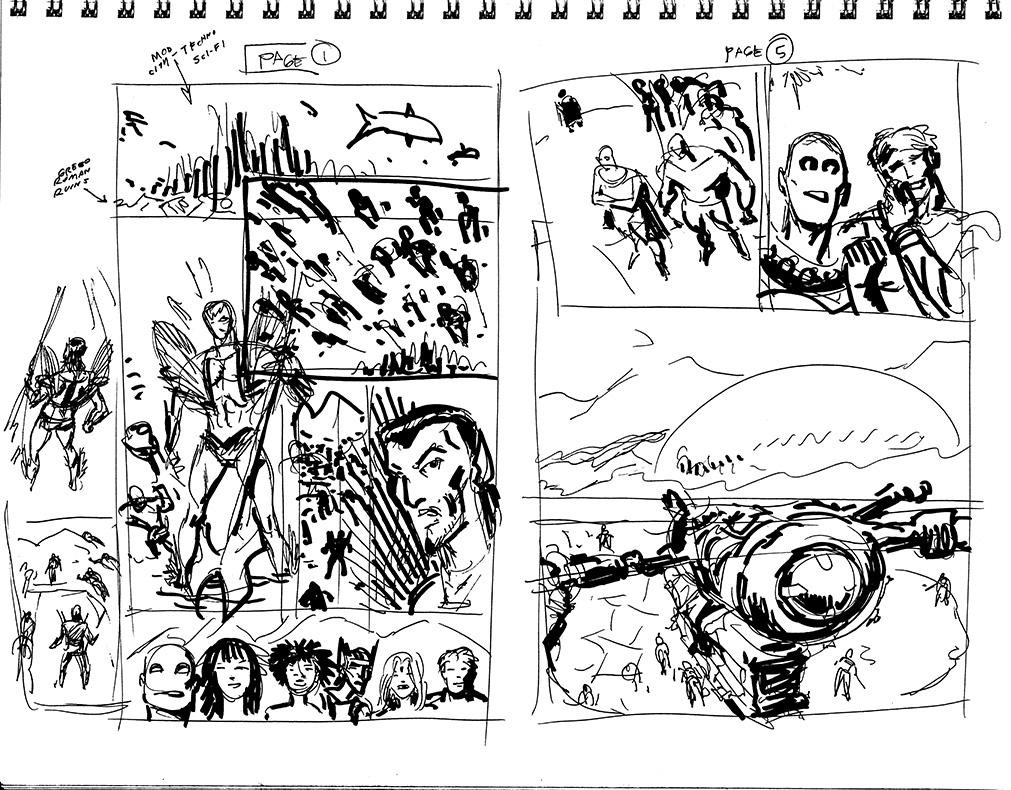
Sketchbook roughs of pages 1 and 5.

Sketchbook roughs of pages 6 and 2.

Sketchbook roughs of pages 4 and 3.


Excelsior!

Simpson Sampler I: Golden-Age Meltdown! | Simpson Sampler III: Web-Rocks!

Saturday, July 25, 2015

Pittsburgh Talent City: Illo for Annual Report

Illustration of The Pittsburgh Foundation's Annual Report...

Update Monday June 28 2015: The almost final shaded version...


Pen and ink on Bristol board.
The original blue and graphite pencil art.

Flat coloring with some editing of the lower right panel.
Original concept sketch forwarded to me by Rob Rogers, who got me the gig! Thanks, Rob (and we're forwarding your samples to DC Comics -- expect a call from the Superman editor, they're looking for a fresh take!)